Hey there, I’m Mia, and I’ve been running a cardboard floor display stand supply business for nearly 12 years. I’ve worked with everyone from small local snack brands trying to pop up at farmers’ markets to massive cosmetic giants rolling out new holiday lines at every major drugstore chain. The question I get asked most by my clients—after “Can you ship these next week?”—is how to make those cardboard stands actually stop shoppers in their tracks. Cardboard Floor Display Stand
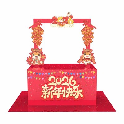
Let’s be real: cardboard floor displays are such a smart choice for retailers. They’re lightweight, easy to assemble and ship, way more cost-effective than metal or acrylic alternatives, and way more eco-friendly too. But for all their perks, a boring cardboard stand can get lost in the chaos of a busy store. Last year, I had a client who made custom energy drinks—they came to me with a basic black cardboard stand that had nothing more than their logo printed on it. A month later, they texted me a blurry photo of their display tucked behind a stack of soda boxes, and their sales for that SKU were down 18% compared to the same period the year before. That’s when I realized: it’s not enough to just send a good quality stand to a retail space. You have to make it work for that specific store, that specific product, and that specific target audience.
Over the years, I’ve tested dozens of small tweaks with clients, tracked sales data, even sat in stores watching how shoppers move (turns out, most shoppers only glance at displays for 2-3 seconds—no exaggeration). Today, I’m breaking down the strategies that actually make a cardboard floor display stand eye-catching, no fancy printing budget or complicated design degree required.
First, let’s talk about the base: placement and orientation. You can have the most vibrant display in the world, but if it’s tucked in a dead corner of a store, no one’s going to see it. I once had a baby product client who wanted their new baby wipe stand next to the diaper aisle, which makes total sense, but their first draft was placed too close to a big end cap of formula cans. We adjusted the angle to face the main foot traffic path between the front door and the baby section, and their sales jumped 22% in two weeks. Here’s the science behind it: most stores have a “power aisle” or main shopping lane that’s designed to move foot traffic. You want your display to be at the intersection of that lane and a secondary path—like a crosswalk in a city. Also, height matters a lot. Shoppers don’t want to bend over for a small product or stand on their tiptoes for something too tall. The sweet spot for a floor display is between 48 and 60 inches from the floor to the top of the tallest part of your stand. That’s right at eye level for most adults. If you’re displaying small items like lip balms or candy, add a small riser on the top shelf to bring products up to that height. If it’s a bulky item like a water bottle or a snack bag, make sure the display is short enough that someone can grab a product without reaching over their head.
Next, the design: stop with generic. I see so many clients going for the “big logo and some graphics on a plain background” look, and it just doesn’t cut through noise. Let’s think about how the human eye works. We’re wired to notice contrast first. That doesn’t mean neon colors everywhere—it means using colors that clash just enough with the surrounding store environment to grab attention. For example, if a client is selling organic granola and their display is going in a store lined with neutral wood shelves and beige walls, use a soft olive green and warm terracotta—colors that feel natural but still pop against the background. But if they’re selling a limited-edition energy drink in a store with lots of dark metal shelving, a bright electric blue and neon orange will stop people instantly. One trick I teach all my clients is to pick a “hero color” that’s completely different from the store’s main palette, and use it for the display’s edges, shelf dividers, and even the product labels peeking out. That’s where shoppers’ eyes go first.
Then, there’s interactive elements. This is the game-changer I swear by. A display that’s just sitting there is a billboard—one that’s active is a conversation starter. Last year, I worked with a toy brand that made small puzzle sets for kids. Their original display was plain white cardboard with the puzzle boxes stacked on it. We added a tiny, detachable puzzle piece cutout on the front of the stand, and a sign that said “Grab this free mini puzzle sticker with every purchase.” It cost them less than 50 cents per stand to add that, and their display was the most talked-about one in the children’s section that holiday season. Sales for that SKU were up 47% that quarter. Another interactive idea: if you’re selling skincare products, add a small mirror to the top of the stand so shoppers can test a lipstick or face serum right there. For snack items, add a small tear-off “sample coupon” strip along the bottom edge—people love getting something free, and it gives them a reason to stop and engage with the display instead of just walking past. Even something as simple as adding a few cutout shapes related to your product—like if you’re selling sun care, add tiny cardboard palm trees sticking out of the top shelf—adds visual interest and makes the display feel fun, not just a box to hold products.
Wait, let’s talk about material too. A lot of people think cardboard is just cardboard, but there are different grades, and the quality actually does affect how eye-catching a display is. I never recommend thin, flimsy cardboard that bends or looks like it’ll fall over the second someone brushes past it. A sturdy corrugated cardboard (at least 200 ECT—Edge Crush Test, for the nerds like me) not only looks more professional, but it also holds up in busy retail spaces. If a display feels cheap, shoppers will assume the product inside is cheap, too. That’s a quick win for making your display look better, no extra design work needed. Also, consider adding a matte or semi-gloss laminate to the display surface. It makes the colors pop way more than plain cardboard, and it protects it from spills, dirt, and scuffs—so it stays looking new for the entire 3-6 months most displays are in stores. I had a client once who skipped the laminate on their display for body wash, and within a month, the base had water stains from a leaky bottle underneath. Replacing all those displays cost them way more than adding laminate would have.
Another thing I learned the hard way: don’t overcrowd the shelves. I’ve had so many clients try to fit every single product they make on one floor display, and it looks cluttered and overwhelming. Shoppers don’t want to hunt for something; they want to see exactly what’s available at a glance. Stick to 6-8 products max per display, especially if it’s for a new product line. For example, if you’re selling 10 different flavors of iced tea, don’t stack all 10 on the same stand. Pick the 3 new, limited-edition flavors to feature, and label the shelf clearly with each flavor name. That makes it easy for shoppers to make a decision, and the display looks neat, not messy. If you have more products, split them across two small displays instead of one big one—two smaller, focused stands will catch two different areas of foot traffic, instead of one big one that’s too much to take in at once.
Oh, and lighting! You might not think of lighting for a cardboard display, but it’s so effective, especially for stores that have dim lighting or are open late. I worked with a makeup brand that sold highlighters and lip glosses that look amazing under warm light. We added tiny, battery-powered LED strip lights along the top edge of their display—no wiring, no complicated installation, just peel-and-stick that runs for 6 months on a single battery. Their display was the first thing people noticed when they walked into the store after 7 PM, and sales for those highlighters went up 32% in the first month. The best part? The LED strips are lightweight and easy to add, so it doesn’t add much to the cost of the display. Just make sure you pick cool or warm white lights that match your product—warm lights are great for skincare and makeup, cool lights work for tech or electronics.
Wait, let’s get real about testing. I always tell clients to make a prototype of their display before ordering 50 or 100 of them. Spend a small amount of money on a sample, take it to the store where it’ll be placed, and watch how shoppers interact with it. Do they walk past it? Do they stop and look? Do they grab a product? I had a client once who was convinced their display for a new energy bar was perfect, but when we set up the prototype in the store, we noticed that the shelf labels were too small—you couldn’t read the flavor from 5 feet away. We reprinted the labels in a larger font, and that small change alone increased the number of shoppers picking up the bars by 15%. Testing is so important because what looks good on a computer screen doesn’t always work in a real, busy store.
And don’t forget about brand consistency. Even if you’re making it eye-catching, you still want shoppers to recognize your brand. I see clients making the mistake of ditching their logo entirely to use all bright colors, and then shoppers have no idea whose product is on the display. Your logo should be the focal point, not the graphics. Place it at the top of the display, right at eye level, in a font and color that matches your existing branding. That way, when a shopper sees the display, they’ll remember your brand—even if they didn’t stop to buy the product that day. Maybe they’ll come back next week looking for it, because they saw that bright stand with their favorite snack’s logo on it.
I’ve had clients who come to me wanting a display that looks like a piece of art hanging in a gallery, but I always remind them that a floor display’s job is two-fold: to catch attention, and to sell products. You don’t need to spend thousands of dollars on custom designs to do that. The best displays are simple, tailored to their space, and designed with the shopper in mind. Let’s circle back to that energy drink client I had at the start of this post. A year after their sales dropped with the plain black stand, they came back to me with a new product line. We worked together: we placed their display at the main aisle intersection by the front door, used their hero neon color to contrast with the store’s neutral walls, added small tear-off coupon strips for a free can, and put their logo front and center at eye level. Their sales that quarter were up 59% from the same period the year before. That’s the power of small, intentional changes to a cardboard floor display.

If you’re a brand owner looking to make your cardboard floor display stand stand out in crowded retail spaces, I’ve got you covered. I work with all types of businesses, from small startups to national brands, to create affordable, eye-catching displays that actually drive sales. Whether you need a prototype tested, help picking the right materials, or just want to bounce ideas off someone who’s been doing this for over a decade, I’m here to help. Reach out to discuss your project, and let’s create a display that doesn’t just hold your products—makes shoppers stop, look, and buy.
Freestanding Display Stand References
- Retail Industry Leaders Association. (2022). In-Store Shopper Behavior Report: Understanding Foot Traffic and Attention.
- Corrugated Packaging Association. (2021). The Impact of Display Design on Retail Sales Performance.
- Journal of Retailing and Consumer Services. (2020). Visual Attention and Point-of-Purchase Displays: A Meta-Analysis of Field Studies.
- Energy Star. (2021. Battery-Powered Lighting Solutions for Retail Displays.
- Edge Crush Test (ECT) Standards for Corrugated Fiberboard. American Society for Testing and Materials (ASTM) D7264, 2019.
Guangzhou Guangjie Display Products Manufacturing Co., Ltd.
We’re well-known as one of the leading cardboard floor display stand manufacturers in China, also support customized service. Welcome to buy bulk high quality cardboard floor display stand at competitive price from our factory. If you have any enquiry about pricelist and quotation, please feel free to email us.
Address: No. 16-1 Lilv Road, Dashi Street, Panyu District, Guangzhou City, Guangdong Province
E-mail: guangjie_dp888@163.com
WebSite: https://www.gjdisplaystand.com/
